
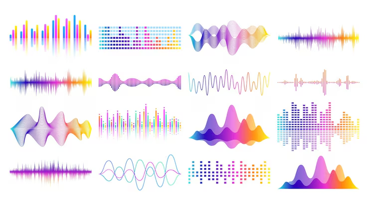
Any great design, much like a sentence, requires rhythm. It requires pauses, outbursts of energy, and the proper pace from one idea to the next. Color is the punctuation that directs that rhythm in visual storytelling, the exclamation mark to get your attention, the comma to give your eyes a break, and the ellipsis to leave you wanting more. With Dreamina’s AI photo generator, designers have the freedom to play with these visual pauses and inflections, experimenting with how color punctuates emotion, timing, and meaning in one composition.
Colors don’t occupy space; they choreograph attention. The correct hue in the correct location can shift how a message breathes. Consider a campaign poster. one rich blue corner soothing the eye and an abrupt injection of coral startling the story to life. Each color contains tone, pace, and subtext. And when applied rhythmically, they transform flat images into expressive sentences that come alive to read.
When color turns into language
Designers have been well aware of the fact that color is emotional grammar. a system of visual clues that enables the audience to feel meaning before they necessarily grasp it. But then what if color begins acting like punctuation marks?
- Commas of calm: Soothing tones and white space slow down the reader’s eye, creating balance and breathing room between visual phrases.
- Exclamation colors: Vivid splashes of opposite color, magenta over monochrome, for example become emphatic accents, adding vigor or a sense of urgency.
- Circles of calm: Strong, dark centers or perimeters can indicate stability or closure, anchoring the design.
- Ellipses of curiosity: Gradients or gentle fades that fade away encourage the viewer to stay awhile, a pause that promises something more to follow.
Color placement can make or break how your audience speeds through a poster versus lingering to investigate it. As with punctuation, color manages tempo, and good designers set them down as deliberately as authors refine sentences.
Orchestrating color rhythm with Dreamina
Dreamina provides artists with a platform on which to play with this visual language, to try out the way rhythm sounds as colors dialogue, rather than merely exist alongside each other. Whether you’re designing marketing graphics, digital billboards, or conceptual art, you can hone the way tones move, pause, and swell throughout your design narrative.
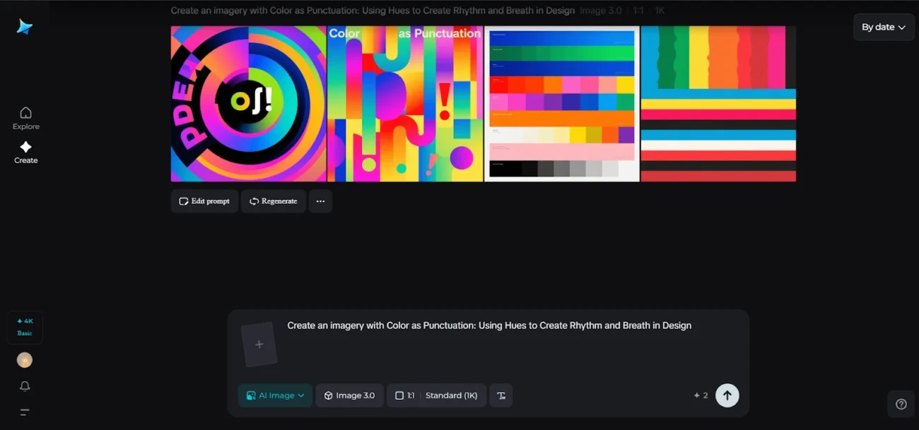
Step 1: Write a detailed text prompt
Begin by going to Dreamina and creating a rich, descriptive text prompt that sets your desired rhythm. Don’t tell the subject, tell the color of tone.
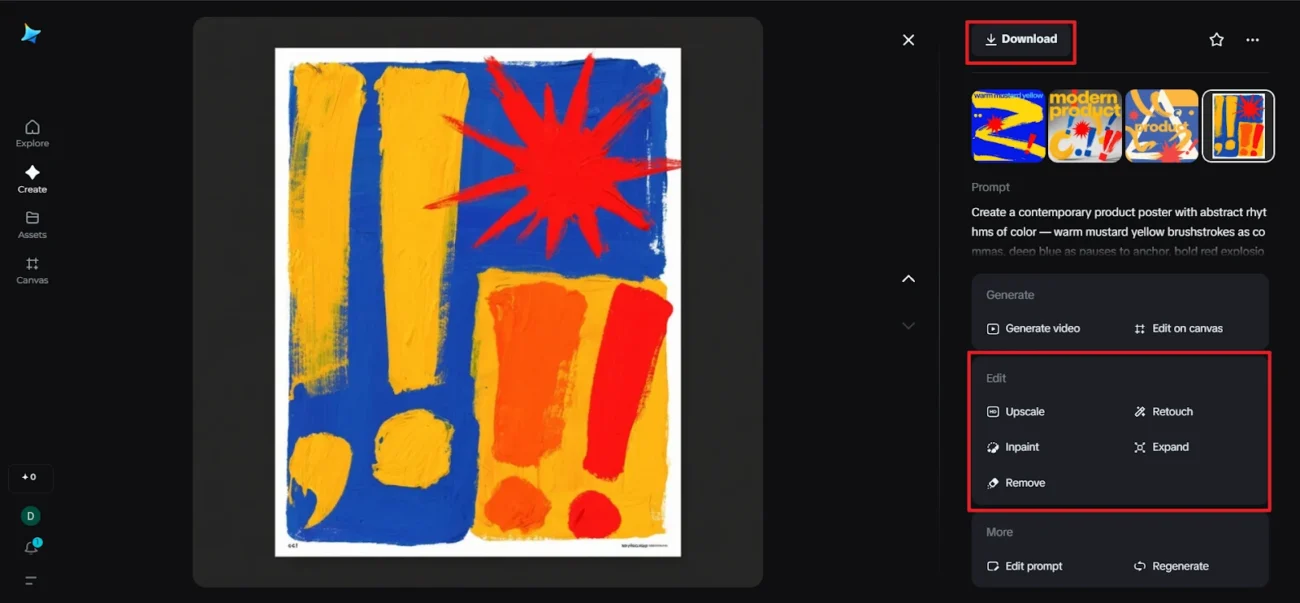
For example: A contemporary product poster with abstract rhythms of color, warm mustard yellow brushstrokes as commas, deep blue as pauses to anchor, bold red explosions as exclamation points. The layout looks balanced, lyrical, and replete with visual breath.
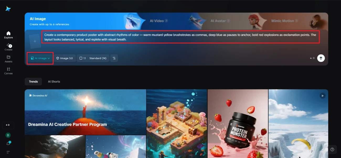
This kind of precise prompt enables Dreamina to convert emotional rhythm into visualization rendering your conceptualized punctuation as living colors.
Step 2: Refine parameters and create
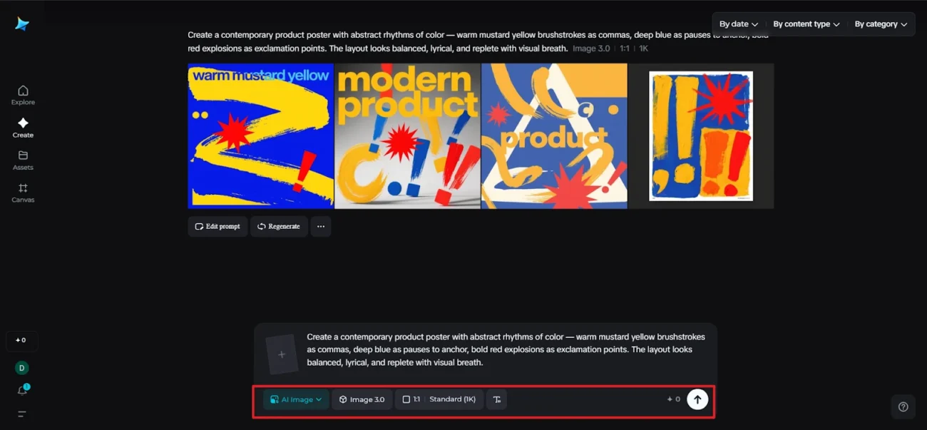
When your prompt is set, it’s now time to shape the output into precision. Refine the model for the visual approach that best aligns with your objective, realistic, abstract, or painterly. Adjust the aspect ratio according to your format (poster, advert, or digital billboard). Then select the canvas size for your artwork, and select the resolution 1k for draft checking or 2k for sharp, print-ready texture. Lastly, click on Dreamina’s icon to create and see your color rhythm emerge.
Step 3: Edit and download
Now refine the image with Dreamina’s AI customization options to tweak how colors breathe together. Use inpaint to highlight important color points, expand to increase gradients and transitions, remove to eliminate distractions, and retouch to manage saturation and contrast. When your rhythm is seamless, click the Download icon to save your finished visual composition ready to perform on screens or in print.
The rhythm between emotion and perception
Upon encountering an aesthetic, their eyes are subconsciously following a tempo. Some colors feel like quick beats; other colors hang on longer. Designers can control the pacing with contrast, spacing, and repetition, creating the emotional reading of the visual.
- Pacing through repetition: Repeating a particular accent color (for example, coral or teal) at intervals creates a sense of rhythmic familiarity – the visual version of a repeated line in a poem.
- Pauses by balance: Off-white or gray neutral colors enable the viewer to catch their breath like commas between the bursts of color.
- Crescendos by saturation: Gradually increasing from pastel to full color tenses the viewer’s gaze at the center, like a musical crescendo.
Color rhythm doesn’t work through logic, but through feeling in the same way that we feel the rhythm of language. A piece of music that “feels right” is often because the color punctuation has achieved its ideal tempo.
Branding with tone and tempo
For brands, command over this color rhythm can establish identity. Notice how the tempo of color can echo the voice of the brand:
- A health brand could whisper, in terms of drawn-out gradients and soothing punctuation colors.
- A technology startup could prefer staccato vigor bold, unapologetic colors that burst like self-assured interjections.
- A high-end label could suspend the rhythm altogether, in terms of sparse color punctuation and luxurious, expansive pauses.
To ensure this rhythm is sustained throughout your overall brand presence, Dreamina’s AI logo generator can assist in testing how your selected color scheme translates into symbols and marks. It’s not merely about matching hues but keeping rhythm keeping the brand’s visual “voice” consistent in every touchpoint, from packaging to online presence.
Reworking the melody of your images
Occasionally, a design appears right, but doesn’t feel right perhaps the colors scream when they need to whisper or hasten when they need to slow down. This is where Dreamina’s AI image editor proves useful. Designers are able to go back and revisit their color arrangement, modifying warmth, saturation, or light direction to perfect pacing.
So, for instance, blurring a highlight can change a forceful exclamation into a reflective hesitation. Moving the temperature of a shadow can warm up an icy, remote picture and make it closer. The AI image editor is your color conductor making every color strike its note at the opportune time.
The silent strength of punctuation
Ultimately, color rhythm is neither about madness nor ornamentation it’s about dialogue. It’s about taking the eye on a gentle journey through a field of feeling and significance, allowing the eye to linger where it must and zip where it should.
Dreamina simplifies this choreography. Through its smart generation capabilities, designers can play with visual grammar at the pace of imagination composing where color doesn’t merely occupy space, but communicates.
So the next time you create, think like a writer. Allow your colors to punctuate your tale: commas of serenity, exclamation blazes of ardor, and soft fades of questioning. Because in the design of art, color isn’t merely viewed it’s read.